A view into our bedroom. I love the wainscoting. Hate the carpet.
This room has the most direct sunlight aside from the living room, so it feels kind of light, airy and romantic.
 |
| Bedroom |
Click on the "read more" link to see more pics!
Here's Grant's
office. That radiator pipe could really use some help. The flooring, on the other hand, is a stunning
old parquet.
 |
Office
The bathroom. Pros: clawfoot tub, classic tiling. Cons: exposed piping, super small. |

|
Bathroom
Well, the kitchen is arguably the ugliest room in the apartment. But, I have big plans for it. At least it's much larger than a typical NYC apartment. |
 |
| Kitchen |
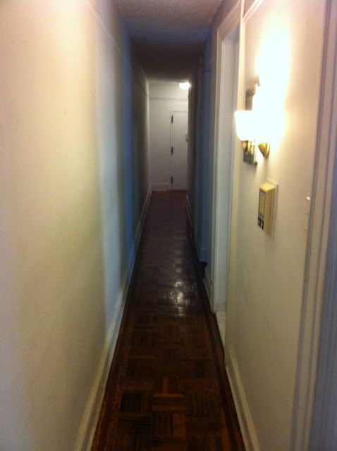
The looooooooooooong
hallway. Perfect for a
picture gallery, a runway for Homer and a vast expanse to scream at Grant down.
 |
| Hallway |
So, here's the
dining room. Again, the flooring is amazing. This is the largest room in the apartment. And how much do you love that
chef's door? It actually swings! I feel so fancy!
 |
| Dining Room (facing kitchen) |
This is a view from standing in the dining room, looking into the
living room. At some point the flooring got changed out for something awful. Must get tons of rugs. On the plus side, there's
plenty of natural light!
 |
| Dining Room (looking into living room) |
Standing in the
living room, looking into the dining room. That door on the far left is a massive
storage closet. The doorway in the distance with the man standing in it (that's our realtor, Peter) is the entrance from the dining room into the hallway. The
shelved moulding in the dining room is just begging for some leaning pictures.
 |
| Living Room (looking into dining room and closet) |


I'm testing out my comments! Woo!